
Those who hate the use of numbers when analysing wine will probably cringe at this, but I've been toying with this chart for a couple of months now. Previously, I've never seen fit to publish it, because too many times the analysis resembled a straight line with only minor deviations. Unfortunately for the good people at Jacob's Creek, their 2009 Reserve Cabernet Sauvignon is the first wine I've encountered where the graph illustrates its point quite well. We're clearly shown how a wine can present so much initial promise, yet fall apart badly with deeper inspection. In a visual way, it sums the wine up nicely I think.
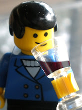
I actually sampled this wine not that long ago, towards the end of an all night binge of drinking Coonawarra reds, and was enamoured (enough for a Jacob's Creek Reserve wine anyway), which is why I bought one. Clearly, in a drunken haze, I was attracted to it more by its packaging and aroma then I was by its palate (of which, mine was probably shot by that point of the night).
As for the chart, I've purposely chosen 'packaging' instead of 'appearance' or 'colour', because I find I get more of a sensory thrill from a wine's label than I do its physical appearance (although I do fall for a sexy, unfiltered pinot...). Additionally, I've messed around with the idea of changing it from a score of 0-10 along the y-axis to a score more relative to the 100 point scale, e.g. 85-95 or something like that. It might be more comparable.
But be warned, this chart may return! So if anyone has any hints/tips/ideas on how it could be improved, I'd be MOST appreciative. To say it's in its infancy would be an understatement - I don't even know how to use it yet!
I'd been playing around with an iPad Bento database thing along the same lines, working on the principle that you want something you can carry with you into places where you're not guaranteed to find something to write on.
ReplyDeleteAnd you can lose or misplace pieces of paper. You're more likely to look after expensive consumer toys.
Chris,
ReplyDeleteI like the idea, and the flow of scoring events and the image created. Have you seen the slightly messier multi axial graphs which resemble a spiders web? I've toyed with the idea of using one of those for a tasting note.
http://en.wikipedia.org/wiki/Radar_chart
ReplyDeleteRather than have "overall impression" as a separate category, you can then use the area under the curve to represent this.
Hughesy,
ReplyDeleteI don't have an iPad, but I am always looking for things to write on...
Ed,
ReplyDeleteOne of the main problems I've had in using this chart is converting myself to an 'out of 10' scoring system. I'm certainly not concrete in what is a 7, a 5, a 3 or whatever. Needs some tinkering or perhaps repetitive use.
I'd love to see a spider-web style graph over on Wino-sapien one day. If anyone could pull it off, it would have to be you. :)
It was only the other day I was marvelling at an old image of yours, with a partially filled decanter and a single drop of wine... I hope you know the one. :)
Anon,
ReplyDeleteThanks, with common sense I guess 'overall impression' would have to be the first one to go. Just looking at it here probably gives the wine's graph an extra little bit of glory it might not have deserved. In hindsight, a straight drop would've been more accurate. Thanks. :)
Cool infographic! Very cool! NIce work.
ReplyDeleteCheers AG. Next one probably won't be too far away. I'm just waiting for another wine that makes it look rather relevant. 'Overall impression' is definitely getting dropped off though.
ReplyDelete